Skip to main content
OZ Poster

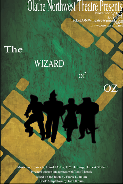
Contrast
- Contrast is used to bring attention to information and title first
- Also used to highlight the characters
- Differentiates background from foreground as well
Alignment
- Top right is information about times and price
- Bottom is miscellaneous stuff that is required
- Middle is title
- Very top is school
Repetition
- Used same fonts
- Smaller font size on information
- Bigger fonts on title
- Green and yellow used
Proximity
- I aligned all of the info together
- Miscellaneous stuff grouped at bottom
- Title grouped together

Comments
Post a Comment